Sway
Suggested content filtering.
2017 | development
TypeScript
A Collaboration with the Sway authoring team.
The following reflects my personal point of view and does not represent the views of Microsoft.
Sway, part of the Microsoft Office suite, is a web application for creating engaging, interactive, web-based presentations that look good on any device. I've worked on several features in my two years as a software engineer on the product, most of them central to the user experience of creating Sways. This feature, which I helped identify the need for, prototype, and ship, solved a common usability issue in the app.
Note: All thoughts are my own, and do not represent an official statement by Microsoft.
The problem
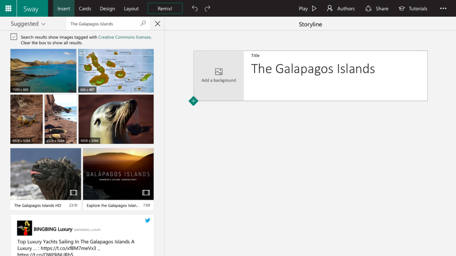
One of the things that users love most about Sway is the ability to search for images and videos without leaving the app. While creating a Sway, you can click the “insert” button and a pane pops out, filled with images and videos from the web. It used to look like this:

After running a study on usertesting.com to identify usability pitfalls in the Sway creation experience, we found that users had a difficult time telling the difference between an image and a video in the content pane, and knowing where they could drag and drop each onto the authoring surface.
Often, the first piece of content users try to add to their Sway is a background image on their title card. The title card only allows an image to be dropped into it, not a video. But the video thumbnails in the content pane look similar to the images. When a user tried to add a video (that they thought was an image) to their title card, the content wouldn't stick in the title background spot, and would instead jump below the title, creating a new video card. At this point it was still unclear that the content was a video, and the user would keep trying to drag it into the title card and wonder why it wouldn't stay there. The experience was incredibly frustrating.
Telemetry told us that in about 20% of Sways, a video was the first piece of content a user added. We hypothesized a large portion of these videos were added by mistake, and that once we made the experience more clear, this percentage would decrease.
The solution
There were many possible ways to solve this problem, but the solution we decided on was one we believed could help us make big usability gains in a short amount of time.
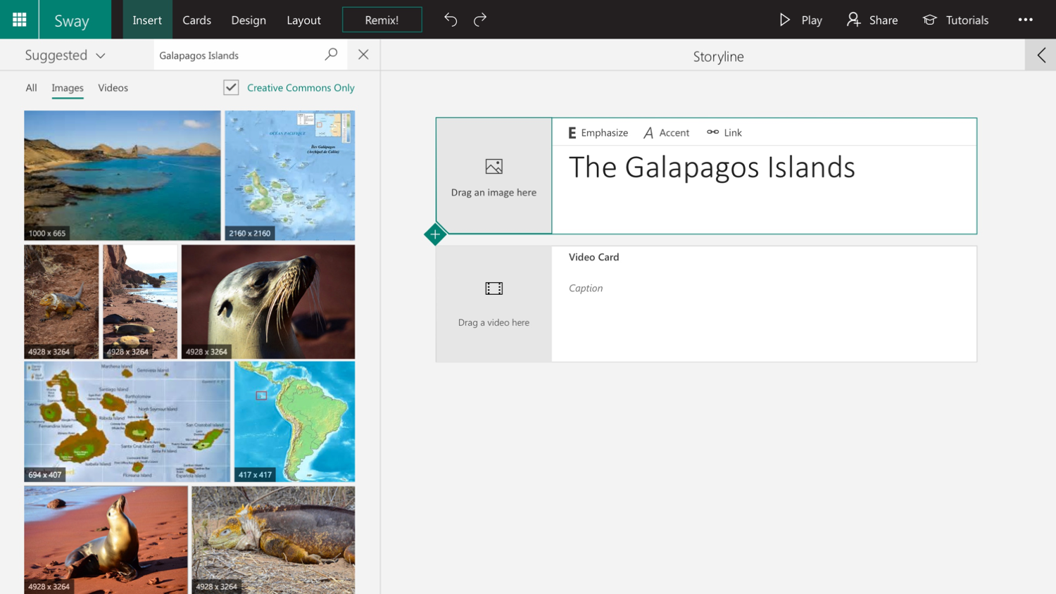
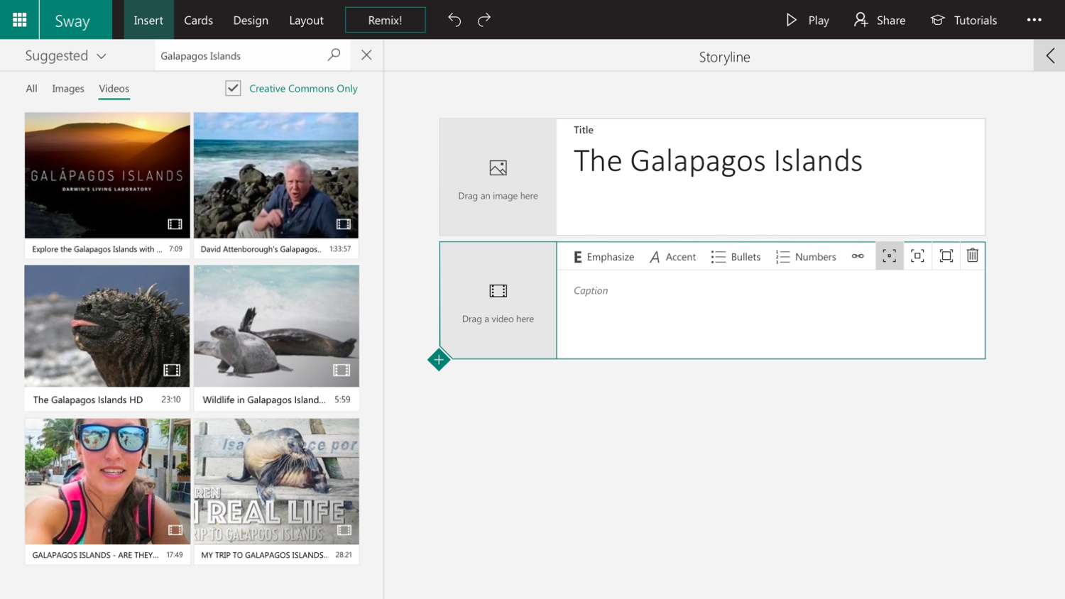
We added simple filters to the content pane to differentiate between different types of media. Crucially, the filters are context-aware, so they show the type of media that the user is most likely to want to add next based on the current state of the app.
For example, if the user clicks on the image placeholder inside of their title card (thereby opening the content pane), the pane opens to show only images, like this:

If the user then moves their focus to a video card, the filters change to show only videos.

If the user wants to browse different types of media, they can escape the filtered view at any time by clicking the "All" filter.
When implementing the feature, I wanted to make sure that filter switching took place seamlessly, so all filtering is done client-side. A single request is made to the server upon the initial search (just as it was in the old version), so all search results are already loaded on the client; switching filters only determines which pieces of media are shown and which are hidden. This means that switching the filter doesn't incur any latency.
Results
After releasing the filtering feature, we found that the percentage of Sways where a video was the first piece of content added dropped to 10%. We confirmed through qualitative testing that the experience was much less confusing for users. We even saw a small increase in the percent of users who did a significant number of actions while in the Sway creation experience, indicating that the filtering feature helped to alleviate some frustration and keep users engaged in the process for a longer amount of time.